

- KISWEL clients are always right
PUBLIC RELATIONS
Corporate Identity
- Logo Type
-
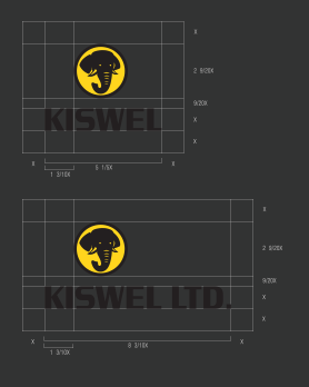
- Symbol MarkGrid System
-
The design of the KISWEL symbol must not be modified so that its representative image is correctly conveyed and better recognized visually. In case of enlargement/reduction or computer printing, reproduced script should be used. For stamping purposes, care should be taken to avoid misshaping the original form of the symbol.
 ■ COLOR SYSTEMKISWEL Stainless steelSpot: Pantone 877C
CMYK : 23 / 16 / 13 / 46
RGB Web : 138 / 141 / 143
- Symbol MarkRules for Printing in the Four Primary Colors
-
When printing the KISWEL symbol in four colors, its hue or color tone could change depending on the printing equipment, the printing ink, the printing material, or the processing methods.
It is thus worthwhile to take extra care when printing with four colors if you’re aiming for the same level of results as in spot printing. Our policy regarding the spot color printing ratio must be adhered to as it will give you the closest result to the original colors. Otherwise, the corporate identity of KISWEL would become distorted. ■ COLOR SYSTEM_Basic PolicyKISWEL YellowProcess
M20%, Y100%KISWEL BlackBlack 100%■ COLOR SYSTEM_Spot Color CompositionKISWEL YellowSpot: Pantone 116c
CMYK : 0 / 18 / 100 / 0
RGB Web : 255 / 207 / 001KISWEL BlackCMYK : 0 / 0 / 0 / 100
RGB Web : 0 / 0 / 0
- Signature
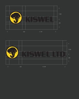
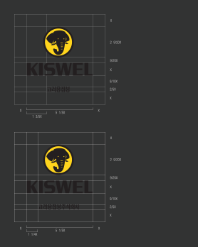
- The KISWEL Signature must be applied in its original form with no exception. Changing the size or the gaps of its Logotype, in particular, will be detrimental to the consistency of our Signature system and may cause confusion.
- Color System
-
■ Corporate Colors
Our corporate identity uses two different color schemes – the corporate color scheme and supplementary color scheme. From the corporate palette, the KISWEL Green Pantone 355C is used for the Logotype in Korean and English. Depending on the medium, the Logotype can be white or black against a green background. The KISWEL Green Pantone 116C can only be used in the company symbol.
-
KISWEL Green
Spot: Pantone 355C
CMYK : 86 / 16 / 100 / 3
RGB Web : 0 / 149 / 59Process
C100%, Y100% -
KISWEL Yellow
Spot: Pantone 116c
CMYK : 0 / 18 / 100 / 0
RGB Web : 255 / 207 / 001Process
M20%, Y100% -
Black : 100%
■ Supplementary ColorsThe colors on our corporate identity allow a degree of flexibility if it is in effect to increase efficiency in the communication.
Thus the use of supplementary colors should support that of the corporate color scheme, and it can be applied in various objects and media such as a signage system and labels-
KISWEL Light Gray
Spot: Pantone 420C
CMYK : 21 / 17 / 17 / 0
RGB Web : 200 / 200 / 200 -
KISWEL Dark Gray
Spot: Pantone 425C
CMYK : 6 / 56 / 52 / 29
RGB Web : 84 / 87 / 90 -
Brass
-
Stainless steel
Spot: Pantone 877C
CMYK : 23 / 16 / 13 / 46
RGB Web : 138 / 141 / 143
-


